


Primary colors
The three primary colors are red, yellow, and blue. Any color can be created from primary colors, but primary colors can’t be created from other colors.
Secondary colors
Secondary colors are created from combining two primary colors, and consist of orange, green and violet.
Helpful Tips
It’s good to understand colors can be warmer and cooler. For example, you can have a red that is warmer or more purple. A warm red will be more orange, meaning it has more yellow (red + yellow = orange) or cool red will have some blue in it (red + blue = purple).
This helps you understand in part why some colors are stronger than others. For example, if you start with a warm red (a red that has yellow in it) and you add blue to make purple, the purple you get will be muted or even muddy because the yellow will dull the blue (yellow + blue = green).
Tertiary colors
Combining primary and secondary colors creates tertiary colors. These colors are red-orange, red-violet, yellow-green, yellow-orange, blue-green and blue-violet.
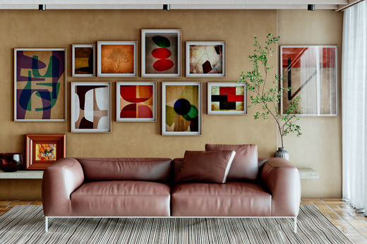
Monochromatic colors
Colors from the same color family tend to look great together. Monochromatic color schemes use tints and shades of the same color to create a sophisticated and elegant look. Tints are created by adding white to a color. Shades are created by adding a black or combination of colors across the wheel.
Analogous colors
Developed from colors next to each other on the color wheel, analogous color schemes offer more nuances while retaining the elegance of the monochromatic scheme. Usually, one color is used as a dominant color while others are used to enrich the scheme.
Complementary colors
Complementary colors are opposite from each other on the color wheel and add drama to any room. These contrasting colors enhance the temperature of each other, which adds interest and energy to the décor. To get the most out of this scheme, use a warm color against a cool shade or add contrasting accessories to highlight the color of your walls.
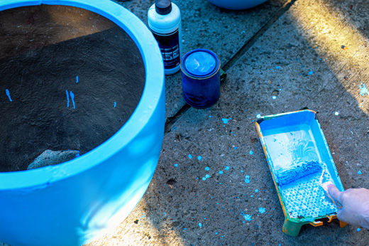
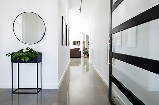
Project Shopping List
Here’s what you’ll need to complete a painting project successfully.
- Sponge
- Mild detergent
- Towel
- Spackling compound
- Fine-grit sandpaper
- Putty knife
- Cloth
- Wall-repair patch (optional)
- Joint compound
- EasyCare Ultra Premium Interior Primer/Sealer
- EasyCare Ultra Premium Interior Paint
- Small or medium-sized paintbrush
- Small roller applicator (optional)
- Angled foam brush (optional)
- Paint reducer