Color Psychology: Choosing Home Color Schemes

A color scheme brings cohesiveness to your home’s appearance. But how do you go about choosing one that reflects your personality and tastes? It’s not as simple as choosing your favorite colors and then starting to paint.

Creating the perfect color scheme takes time and research. This project will help you learn some of the tricks interior designers use to create appealing color combinations that make rooms pop.

Step 1: Study the Psychology of Color

Decorators know the way we perceive color is very personal and emotionally charged. Colors can make us feel calm or energized, happy or sad, edgy or relaxed. They can affect the mood of a room as well, making it seem open and airy or small and cozy. The important part of choosing home color schemes is finding the colors and shades that are right for you and your family. Keep in mind that soft and earth-tone shades are beautiful neutrals of a more intense primary color. Here’s a quick guide of which moods different colors represent:

White

White represents cleanliness and youth. It creates a cool and refreshing feeling. A warmer shade of white can help make a room feel cozier, while cooler whites tend to achieve a more formal feeling.

Bright white living room with black accents

Black

Black represents elegance, mystery and power. Those who like black are ambitious and sophisticated. Remember though, too much can be depressing.

Helpful Tip

Consider using black as an accent color to add drama to your room.

Sophisticated, black bathroom

Red

Red is among the most psychologically stimulating of colors. It is the color of confidence and creates excitement and energy. It brings to mind passion, energy and courage.

Office with bright red accent wall

Brown

Brown represents earth, security and contentment. It gives a sense of simplicity and comfort.

Plush living room with brown beige walls

Orange

Orange is considered wholesome and fruitful. It symbolizes balance, warmth, enthusiasm, vibrancy, and demands attention. Orange stimulates the appetite and can add spice to a dining area.

White kitchen and dining room with bright, orange cabinets

Yellow

Yellow represents happiness, optimism, inspiration and summer. Pale yellow brings a sunny feel to a space without being overwhelming.

Small, white living room with yellow, orange, and red shelves

Green

Green is the color of nature — calm and relaxing. It’s often described as the color of joy, harmony, life, energy, the environment and money. Those who like green are said to believe in balance, stability and persistence.

Helpful Tip

Bring energy to a room by painting it a shade of lime green.

Green living room with yellow accents

Blue

Blue is calming and cool. It’s the most popular color because it symbolizes the sky and heaven. Because of its calming power, blue works well in a bedroom.

Purple

Purple stimulates imagination. It’s the color of royalty, luxury and wealth. Those who like purple tend to be creative, wise and romantic.

Helpful Tip

Try painting walls a calming shade of lilac for a sense of relaxation and serenity.

Lavender purple living room

Pink

Pink is part of the red color family, but much more delicate. Those who like pink are perceived to be feminine, romantic, innocent and tender hearted. Compared to red, pink is a more tranquilizing color, which can work well in a bedroom.

Bedroom with rose pink wall

Gray

Gray is a classic. Those who gravitate to it gray are intelligent and disciplined. It’s elegant and works well with most colors. Warm gray paired with other warm colors create a lively and inviting space.

Kitchen and dining room with light gray wall and black accents

Silver

Silver represents money, prosperity and wealth. Accenting rooms with the color silver can create a feeling of ornate richness.

Elegant living room with textured silver wall

Step 2: Explore Design Ideas

Dark green living room with yellow and gold accents

One way to help you choose the perfect home color schemes is to peruse design/decorating magazines and books for ideas. Your closet is another great place to start. What colors fill your wardrobe? Do you see mostly brighter shades or quieter shades? Which colors stand out? See what works from these examples and choose colors you like. If you’re not sure what color to start with, look at what is already in each room. A picture, rug, bedspread, window treatments or the fabric on a favorite chair may provide a color pattern and inspiration from which to start. Use these colors to determine the color palette from which you will work. The color schemes of your home should complement what’s already in your home if you are not planning to purchase new furniture and fabrics.

When thinking about your home color schemes, your palette should consist of three colors: a light, medium and dark color. These three colors will form the foundation of your project. Lighter colors should be used as a background. If a color seems too vivid, you can blend in a touch of gray or white. The floor color should be a bit darker than the walls and ceiling. This helps ground the room.

Neutral dining room with natural wood decor

You can use each color more than once for a coherent feeling. Window coverings and large furniture pieces should have the medium-tone from your color palette, especially if it has a tinge of the wall color mixed into it. Darker colors should be used as accents (e.g., accessories and small furniture pieces). Use these to punch up the design and distribute them evenly throughout the room. Be sure to take any existing pieces that will remain in the room as well as the various wood finishes present into consideration when planning.

Helpful Tips

The feeling of a room can be created by using different combinations of color. By rotating the three colors, you can place greater emphasis on the background or furniture. Typically, your eye will gravitate towards the darker, deeper colors such as burgundy, red or royal blue.

To be sure you’re using the right color for your tastes, always check how the colors you choose look in both natural and incandescent light during the day and at night.

Keep colors in adjoining rooms compatible. They don’t have to be the same but should not clash.

Always keep in mind the things you cannot change, such as a fireplace or other feature in your home and adjust your color scheme to mesh with it.

Your local True Value hardware store’s Certified Color Experts can answer questions you have about both exterior and interior paint color combinations and point you in the right direction, based on your preferences. So bring in ideas and pictures of interiors and exteriors you like. While you’re there, you can pick up a Custom Mixed Color Sample to try a few colors on your walls at home. The sample allows you to paint a small space and then live with different options for a few days before making a final decision. You can also pick up Idea Cards that have pre-determined palettes ready for you and/or Trend Cards for the latest colors or Stripe Cards that show shades of the same color.

Step 3: Choose a Home Color Scheme

There are three basic home color schemes. Each has its own appeal, but it’s up to you to decide what you do with your rooms. Let your personality and tastes dictate the scheme you use.

Monochromatic

Monochromatic gray room

Monochromatic color schemes use tints and shades of the same color to create a sophisticated and elegant look. Colors from the same color family tend to look great together.

For a calm, quiet room, select a neutral color like brown or gray and apply different shades or values of that color to various elements of the room. This approach is pretty popular because it allows you to vary the look of the room by changing the accents and accessories. You can add interest to the room by using a variety of textures on the floor, walls and furniture.

Analogous

Off-white room with minimalist decor

Developed from colors next to each other on the color wheel, analogous home color schemes offer more nuances while retaining the elegance of the monochromatic scheme. Usually, one color is dominant while others are used to enrich the effect.

For a relaxing effect, select a color scheme for your home composed of related colors: greens and blues or rose and peach are two examples. Keep the strength of the colors similar for a pleasing look.

Complementary

Blue and white bedroom with green and pink decor

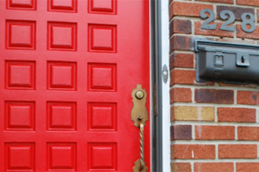
Complementary colors are opposite each other on the color wheel. These types of home color schemes add drama to any room. Complementary colors enhance the temperature of each other, which adds interest and energy to the décor. To get the most out of this scheme, use a warm color against a cool shade or add contrasting accessories to highlight the color of your walls.

Use colors that strongly contrast one another to create a stimulating, lively environment. You can select similar colors in their dark, vivid hues or select complementary colors.
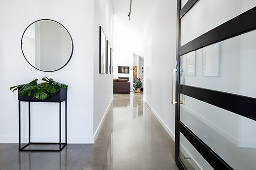
Helpful Tip

How to Paint a Stunning Accent Wall. Painting one wall with another color works well with a complementary color scheme because of the potential for contrasting colors. This creates a focal point in a room.

Dark vs. Light

The color of walls and ceilings can dramatically change the atmosphere. Dark colors can make spaces feel small and cozy, while light colors can make rooms feel larger and more open. A room flooded with sunlight will wash out the wall color; a room that lacks natural light can turn colors grey or muddy.

Hue is the name used to identify a color, such as red. Intensity describes how saturated it is. Value refers to how light or dark it is. Most palettes use three values: light, medium and dark – and this can be an easy way to translate your palette to your room. A light color is often used as background on walls and ceiling. Medium tones are popular for carpeting or large pieces of furniture. A dark floor will ground the space, while a light one can visually open up the room.

If your floor plan is open and rooms flow into one another, choose your main color and paint the adjacent room a shade or two lighter or deeper. For example, if the living room connects to the dining room, different shades of the same color will define each room as a separate space but keep them visually connected.

Helpful Tip

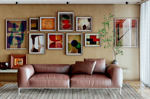
Try the 60/30/10 rule, used by designers. With this method, one color (often a light neutral) is used on about 60% of the room’s surfaces, a secondary color (usually a medium tone) is used on 30%, and the third color (often bold or bright) is used as an accent on 10% of the furnishings. Here’s an example: floors, walls and a large sofa are pale grey (60%); a room-sized rug and two chairs are coral (30%); pillows and other accessories are bright blue (10%).

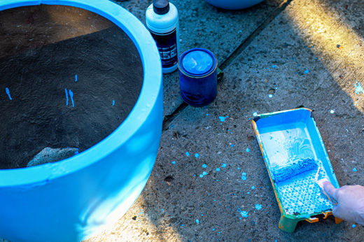
Step 4: Start Painting

Now that you’ve done your homework, it’s time to pop open the paint and start. Remember you can’t always just jump into painting. There’s a bit of prep work to do first. You need to make sure the surfaces are ready to be painted and often you should consider priming the wall before applying paint. For an in-depth “how-to” about painting a room, check out our Paint a Room project.

Good luck! You’re now on your way toward rejuvenating your rooms with interior paint color combinations that can transform your home and an overall home color scheme that can tie it all together.

Project Shopping List

Here’s what you’ll need to complete this project successfully.